Last Friday Anders & I popped down to the exhibition opening for the new show at Nottingham Contemporary. I still really like that building, for me it has a slightly communist feel about the design and I really love the lace panels, such a neat idea to tie it in to the area and give some decoration to what is quite a harsh facade. Anyway, we went to see the new exhibition which is work by Gert and Uwe Tobias (Transylvanian twins - not to be confused with the Cheeky Girls) and photography by Diane Arbus.
I had mixed feelings about the Gert and Uwe stuff. I liked their colour palette and the graphic/illustration style feel of their work, but I really didn't like the figurative pieces. Here's how the Contemporary describes them:
Gert and Uwe Tobias’ large woodcuts, gouache paintings, typewriter drawings and ceramic sculptures combine influences from traditional folk art and abstract art from the early 20th century. Their vividly coloured images, objects and environments evoke a world that is hallucinatory and strange.
I think maybe it's the "hallucinatory and strange" part that doesn't really appeal to me. I tend to dislike whimsy and surrealism and particularly find it difficult to respond to art which combines that with "a sense of humour". On the whole I love humour in art, but probably more when it relates to concepts, rather than funny pictures of funny looking people. It somehow feels linked with that sort of venetian carnival mask look and I'm not keen on that either. Anyway, here are a couple of examples:
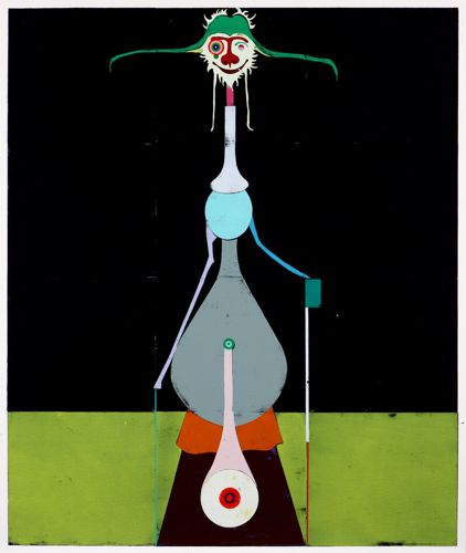
(Thumbs down from me)
(images just seen - thumbs up from me!)
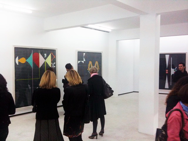
It's so hard to try and encapsulate your reaction to a piece of art, isn't it? I will definitely go and look at their work more and see if I feel differently. One thing I particularly liked was the hanging of their work and the transfer of small design elements from their pieces onto the walls of the gallery itself. It was only a small detail, but I think it really adds something interesting to the exhibition.
Anyway, the main reason I'm writing is to say that the Diane Arbus work was really inspiring and fascinating and enjoyable - I'd recommend a visit to see it. I love photography and it's not often you get an exhibition of this size and quality in Nottingham, so I hope it brings lots of people in. The Contemporary say:
Diane Arbus is one of the most important photographers of the twentieth century, an influential figure whose compellingly honest style of photography paved the way for the work of contemporary photographers and artists.
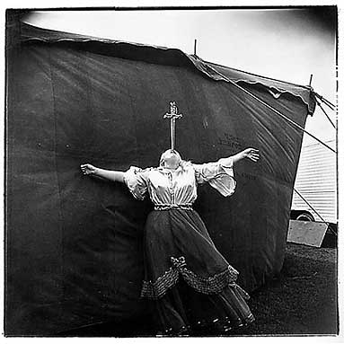
They are wonderful images from a specific period of history and a specific place. They have a distinctly Amercian feel and really capture some of the subcultures around at that time, as well as more general images of children, people in the park etc. This image is one you'll see a lot:

Check this out! I just found it online! Me and Anders were wondering at the show whether anyone had done this exact thing:

Brilliant!
Her photographs have an amazing mood and quality to them, the tone of the black and white is beautifully dark and distinct. I'd love to know enough about photography to be able to use black & white like that.
She works often with people on the fringes of society and her aim was to "photograph everyone". I really like that idea.
Here's one more image which I thought was really powerful and beautiful:
Hope you get to go see the show, and hope you enjoy it as much as I did.
Becky
x
No comments:
Post a Comment